What happens when our values align with our craft
In the agency world, we often talk about "users." We anonymize them, map their journeys, identify their pain points, and solve their problems. But every so often, a project comes along that reminds us that "users" aren’t anonymous numbers: they’re neighbours, friends, and community members, too.
For me, our recent work with the Queer Trans Health Collective (QTHC) was one of those projects.
At Adverb, we’ve always believed that our best work happens when our values align with our craft. Here’s how this project came to life, and why it represents the core of what we stand for.
Investing in our neighbours
This partnership didn’t start with a formal RFP or a business development lead. It started with a shared hallway.
QTHC were our neighbours back in our previous office, where for a long time, we saw firsthand the vital work they were doing on the ground. They provide essential health resources, sexual health education, and harm reduction support to Edmonton’s queer and trans community. Based on our shared values and a mutual desire to see their impact grow, we partnered together to redesign their website so it could better serve their community.
At Adverb, we believe in building with the community, not just for them. We didn't want to force a corporate aesthetic onto a community-driven group. We held a number of conversations with team members of QTHC to deeply understand their unique work and place in the community, which enabled us to develop a final product that would truly reflect the warmth and safety they offer in person.
The power of clear information
Why does a website like this matter so much right now?
We live in an era of information—and misinformation—overload. Now more than ever, access to clear, accurate, and non-judgmental health information can quite literally be life-saving for the queer and trans community.
For the 2SLGBTQIA+ community, navigating the healthcare system is often daunting. Whether it’s finding harm reduction resources or seeking non-judgmental sexual health advice, the barriers to support and information are high. When information is buried under poor UX or clinical jargon, it gets even more difficult..
By focusing on accessibility and clarity, we aimed to turn the QTHC website into a tool for empowerment. We believe that clear and accessible information is a form of care. Providing a digital space that is easy to navigate, identity-affirming, and technically sound isn't just good design. It’s a way to ensure that people can find the help they need without the added stress of a digital scavenger hunt.
Looking forward
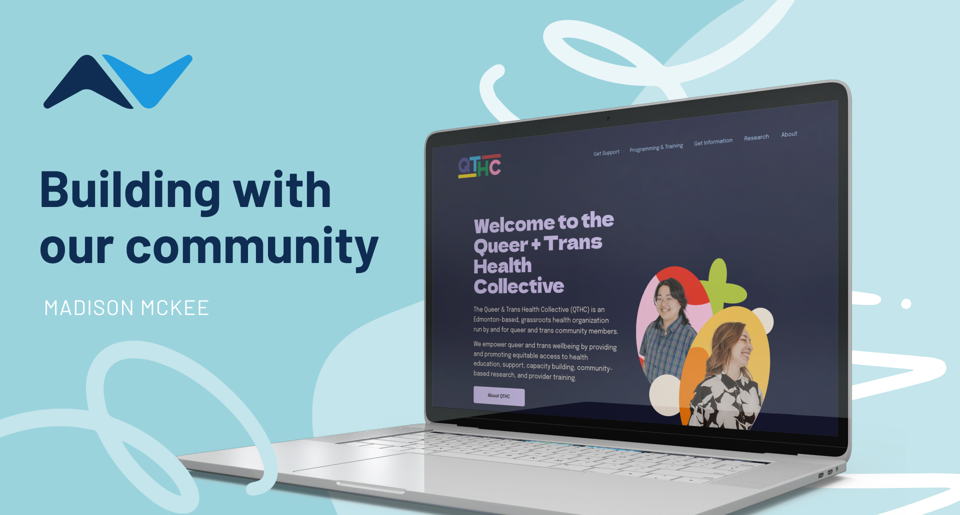
QTHC launched its revitalized website in January, pairing authentic photography with vibrant blocks and shapes. Its dynamic, scrollable layout invites curious exploration, echoing the playful maturity and safe, welcoming warmth of the organization itself.
For me, this project was a reminder of our responsibility as creatives. We have the capacity to shape how people experience the world and how they access essential services.
Design is a powerful tool. We intend to keep using it to build a more informed, healthy, and connected community.